Introduction
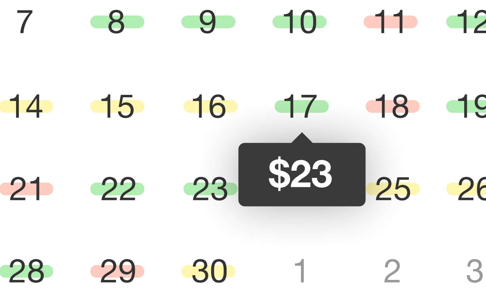
In the world of web development, creating an enticing and user-friendly date picker can significantly enhance the user experience of your website. While traditional date pickers offer basic functionality, adding a touch of color can make your date picker more informative and engaging. In this tutorial, I will walk you through the process of creating a date picker that displays colored days based on pricing. This not only adds a visually appealing aspect to your website but also helps your users make informed decisions when choosing their travel dates or scheduling events.
For this tutorial I decided to use one of my most downloaded plugin called Datedropper, a simple javascript vanilla plugin which through the native onRender callback function, makes everything easy to implement. Of course, feel free to use any other date picker you prefer, the concept is the same.
Understanding the Basics
So, before we dive into the technical implementation, let's break down the core concepts of our colored day price date picker. What we need for to make this happen is to define these three basis:
- Date Selection: Users can select a date from a datepicker.
- Color Coding: Each day on the datepicker will be color-coded based on its price. For example, green for low-cost days, yellow for mid-range, and red for high-cost days.
- Pricing Data: You will need a source of pricing data to associate with each day on the calendar.
So, having gathered this information let's see how to code it!
Coding
For this tutorial, I decided to split the coding part in two sections, the simple version (having the plugin basically do everything) and the advanced one, where I show you how to make the most of Datedropper's features.
Simple version
As mentioned above, in the simple version, we will simply use the native features of Datedropper that allow us to color the calendar days via a simple script. Let's see how:
Step 1: HTML Structure
Start by setting up the HTML structure. In case, I'd just use two input fields for the Outward and Return date, Datedropper will do the rest so no CSS needed for this example.
<body>
  <input class="datepicker" placeholder="Outward">
  <input class="datepicker" placeholder="Return">
</body>
Step 2: JavaScript
The JavaScript code is where the magic happens. As already said, I'm using Datedropper here for speed up this process. Datedropper JS is a Pure Javascript user-friendly date picker that allows users to easily select a specific date from a calendar-like interface. So once set the datepicker, you'll also need to fetch pricing data, populate the calendar, and apply the appropriate color codes to the calendar days.
Thanks to the native onRender function of Datedropper, this process becomes extremely easy. In fact, the onRender function is executed whenever a change is made in the datepicker and returns an object with all the days visible in the calendar and for each day we will get:
- the day node: that allows us to control that element and change it in the way we most desire;
- the function customLabel: that allows us to easily assign a color and a label to each single day without having to customize the node manually (the one for the simple version).
So, let's see how to use the onRender callback and how to pass data to each day through use the customLabel function:
// 1. Get pricing data (this object simulates the way you should obtain your pricing data object)

let pricingData = {
  "2023/09/01": {
    price: 35,
    average: 1 //low
  },
  "2023/09/02": {
    price: 54,
    average: 2 //mid
  },
  "2023/09/03": {
    price: 76,
    average: 3 //high
  },
  "2023/09/04": {
    price: 19,
    average: 1
  },
  "2023/09/05": {
    price: 20,
    average: 1
  }
  // and so on...
};

// 2. Define the function to return color code based on the average

let averageColor = average => {

  if(average==2)
    return "#daa60a"; // yellow

  else if(average==3)
    return "#F44336"; // red

  else
    return "#4CAF50"; // green
}

// 3. Initialize Datedropper by setting up the onRender callback

new dateDropper('.datepicker', {
  range: true,
  onRender: function(dates) {
    Object.keys(pricingData).forEach(function(day){

      let pickerDay = dates[day];
      let pricingDay = pricingData[day];

      pickerDay.customLabel({
        label: `${pricingDay.price}$`,
        color: averageColor(pricingDay.average)
      });

    });
  }
});
Step 3: Integration
Finally, integrate the JavaScript code with your HTML file by adding the following script tag at the end of the <body> element in your HTML file:
<body>

  <input class="datepicker" placeholder="Outward">
  <input class="datepicker" placeholder="Return">

  <script src="datedropper.js"></script>
  <script src="script.js"></script>

</body>
Make sure the JavaScript file (script.js) contains the code from Step 2.
The result
Advanced version
In the advanced version, we will see how to manually edit the node of each individual day in order to directly show the price just below the day so that everything is more clear. This functionality does not exist by default so we will have to manually edit each element of the datepicker. The idea is to add for each day an extra element, with a custom class called .price. This will also give us more control through CSS. Let's see how to do it:
Step 1: JavaScript
The idea here is to leave everything as it is in the simple version by only change the function that returns us the average class (instead of getting the hex color string) and we are going to change a bit the onRender function to get this time the node of each individual day and add to that element an additional node to show the price.
Let see how:
// 1. Define the function to return color class based on the average

let averageClass = average => {

  if(average==2)
    return "mid"; // yellow

  else if(average==3)
    return "high"; // red

  else
    return "green"; // green
}

// 2. Initialize Datedropper by setting up the onRender callback

new dateDropper('.datepicker', {
  range: true,
  onRender: function(dates) {

    Object.keys(dates).forEach(function(day){

      let pickerDay = dates[day];
      let pricingDay = pricingData[day];

      // Create the price node
      let customLabel = document.createElement('div');
      customLabel.className = `price price--${averageClass(pricingDay.average)}`;
      customLabel.innerHTML = `${pricingDay.price}$`;

      // Append the price node to the day node
      pickerDay.node.appendChild(customLabel);

    });

  }
});
Step 2: CSS Structure
As mentioned above we will need in this example to add CSS to change the style of the new element since it is not part of Datedropper's default CSS.
.price {
  position: absolute;
  left: 6px;
  right: 6px;
  border-radius: 1rem;
  bottom: 0px;
  z-index: -1;
  font-size: 0.65rem;
  font-weight: bold;
  color: #222;
}

.price--low { color: #4CAF50; }
.price--mid { color: #daa60a; }
.price--high { color: #F44336; }
Step 3: Integration
Finally, integrate the JavaScript code with your HTML by adding the Javascript file at the end of the <body> as shown in the simple version, and remember this time to add the CSS code to the <head> (through a tag <style> or by adding it on your properly linked CSS).
The result
Conclusion
By creating a colored day price date picker, you can enhance the functionality and aesthetics of your website. Users will appreciate the visual cues provided by the color-coded calendar, helping them make better-informed decisions. Additionally, this feature can be especially valuable for businesses in the travel or event industry.
Remember to replace the sample pricing data with your own and customize the styling to match your website's design. With these steps, you're well on your way to creating an engaging date picker for your web applications.
I also remind you that for this plugin I've used DatedropperJavascript, which with its default functionalities, it easily allows you to change the days based on criteria you choose.
Read also:
- How to make a website accessible in 2025

How to make a website accessible in 2025
Discover the latest website accessibility best practices for 2025. Learn how to design inclusive websites with essential guidelines for accessibility, legal compliance, and enhanced user experience.
- The Evolution of UI Components in 2025

The Evolution of UI Components in 2025
Explore the latest trends in UI components for 2025, including AI-driven design, immersive technologies, mobile-first optimization, and more. Discover the future of user interface development.
